Details
Caption
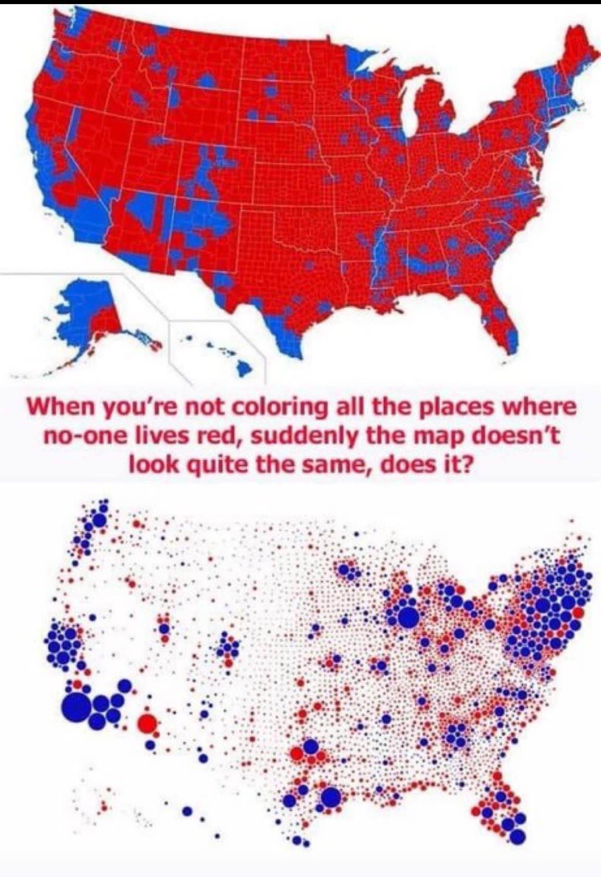
Wait, so you mean the electoral map doesn't actually show population density? Wild.
Tags
Topics
Attributes
- Style: photo
- Format: comparison
- Dimensions: 1170x1707
Color Palette
vibrantCursed Detector
- Cursed Score: 50/100
- Internet Age: ~4 recompressions
- JPEG Quality: ~30%
This meme shows signs of its journey across the internet.
Vibe Check
Dominant vibe: cynical
Cursed
10%
Wholesome
Chaotic
40%
Orderly
Dank
60%
Normie
Edgy
30%
Safe
Low Energy
40%
High Energy
Emotion Breakdown
Overall vibe: ironic
Joy
10
Anger
30
Disgust
20
Sadness
20
Surprise
10
Political Compass
Chaotic Neutral
The meme uses a visual comparison of two maps to highlight how presentation can alter perception, leaning into a chaotic, rule-bending critique of how data is displayed. It doesn't express inherent good or evil, but rather a neutral observation about misleading visuals.